August 16, 1998
By Doc Searls
August 16, 1998 ![]()
Companies hold meetings because they cannot actually masturbate.
— Dave Barry
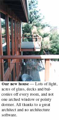 Last year when we sought an architect for our new house, we followed the perfect advice David Ogilvy gave for selecting an ad agency: find work you love and hire whoever did it.
So we found some houses we loved, and discovered they were the work of Bill Patrick, whose Midglen Studios were only a mile away, in Woodside, California. An apprentice of Frank Lloyd Wright, Bill is now seventy-eight, active as a man one third that age and a curmudgeon of the first order.
"I hate architecture software," he says. "It makes you start with a box and then punch out holes for windows and doors." The result, he laments, is a lot of houses that look strangely similar, regardless of their basic style. Tudor, mediterranean, mission, contemporary, modern, Georgian, colonial or ranch, every new or remodeled home has what I call AWPD: arched windows and pointy dormers. Partly this is a matter of supply — Marvin and Anderson stock a lot of arched windows these days (especially popular are these fan-shaped things with fake-o mullions sandwiched between layers of safety glass), and the architects just spec 'em in. But a lot of it is a product of software templates, which urge architects to create roofs with lots of little peaks, under each of which arched windows are now the requisite fashion.
So where does Bill Patrick start, working unassisted by computer?
"I start with the light," he says. "I say 'where do we want the light?'"
We wanted our light coming from the direction of our hilltop view toward San Francisco Bay. We also wanted to enjoy that light outdoors as well as inside the house. The result is a lot of glass on every floor facing the Bay, and a deck or balcony outside every room on the Bay side the house. The roof is nearly flat, to maximize interior space within the local limits on roof height above grade, and the whole thing is not only beautiful, but unlike anything else, anywhere. It expresses Bill's art, and it reflects our original intentions.
In other words, it's a creation, not a replication or a variation. I also can't imagine seeing this house as a template for anything else.
"Maybe I could have done the same thing with software," Bill says. "But it was easier to just do it. Software is useful, but for creating a design it tends to get in the way."
Which brings me to PowerPoint.
First, I've got to say I love PowerPoint, just like I used to love Persuasion, and before that I loved MORE, which was the original presentation program. In fact, I'm one of those guys for whom no software ever got in the way of anything other than the time I should spend away from the computer.
But I do hate how it gets in the way, because it has this fascist wrongheadedness about what a presentation is supposed to be. To me the PowerPoint "Wizard" is this Nazi interrogator who says "Vee haff vays uff making you talk."
Of course, PowerPoint is a little more West Coast than that: its wizard is like a tour guide on a magic bus: "Your presentation is already well underway," it says, two mouse clicks into your creative process. "Click 'finish' to complete your presentation." But it's not your presentation. It's your version of a PowerPoint presentation, which is not about what you want to say, but about how you say it. To quote the manual, "To create presentations, you write and design slides."
Wrong. Presentations are as much about slides as poetry is about handwriting. Again, David Ogilvy: "What you say is more important than how you say it."
My friend Larry Gottlieb is the house "presentationist" (really, that's what they call him) for Lawrence Livermore National Laboratory. His full-time job is to keep software-loving scientists and engineers from burying their "whats" in their "hows." It's not easy, because PowerPoint's "hows" get more numerous and distracting with each new release. MORE, the original presentation software, was a 300k program that turned outlines into "bullet charts," its two-word noun for slides. The latest versions of PowerPoint want 10 megs of RAM and come with 25 megs worth of files. Nearly all of it is about "how" rather than "what."
"The world is full of beautiful presentations that never leave the screen," Larry says. Why? "Because they're just prosthesis. They're speakers' notes. Reminders. They exist for the benefit of the speaker, not the audience. They work so well as a substitute for the Real Thing that when it's over, the speaker feels like he said something and the audience feels like something got said; but in reality nothing got communicated at all. It's all just a simulation. And that's if things go well. More often than not, all anybody remembers — including the speaker — is that a bunch of slides got shown."
Another friend is Jerry Weissman, the presentation guru whose influence on the corporate selling skills of Silicon Valley CEOs should be valued in the billions of dollars, at the very least. A novelist and former television news director, Jerry has worked with a Who's Who of Silicon Valley leaders, from Scott Cook of Intuit to Tim Koogle of Yahoo! Jerry specializes in helping start-up CEOs prepare for their IPOs (initial public offerings) — a service he has also performed for Cisco, Borland, Ascend and dozens of other companies, including Intuit and Yahoo.*
I've collaborated with both Larry and Jerry, and in addition to borrowing some of their wisdom, I've gathered a bit of my own. Here it is.
In the newspaper business they teach you to put the least important stuff at the end, so if your story was cut for length the reader wouldn't miss much. But in a presentation, it helps to start with the end, because that's when the results should start coming in.
There are two ways to start from the end.
The first is asking yourself what results you want from the presentation. Is it sales? Understanding? Recruits? Strokes? Whatever you're looking for, that's where you need to start, because without a clear outcome in mind, there's no way your presentation will come out clear.
The second is to state your conclusion. Larry Gottlieb calls this the 'concluson first' approach. First impressions last longest. If you don't say the one thing you need to say right up front, it may never get heard.
Starting with your conclusion also tells the audience you won't waste their time with preliminaries.
Presentations are personal. You're the one giving the presentation, not your company. Your audience won't buy into what you're saying unless you buy into your own purpose in being there.
It's about trust. People trust honesty, and it's a lot easier for a human being to express honesty than it is for a company. Since companies speak as groups through highly prepared materials, they tend to gloss, exaggerate, omit and distort. This is why "corporate presentations" are always boring and forgettable.
There's a reason you work for your company. That reason is personal. That's what your audience will trust. And that's where you need to come from when you prepare your presentation, and when you give it.
Nothing is more interesting than a story. In fact, just about everything interesting is a story of some kind. Stories are what make news. They are also what make war, sports, love and money.
You have a story to tell. If you don't tell it, you'll lose your audience.
Fortunately, all stories come with exactly three parts: character, problem and movement toward a resolution.
Characters are identities the audience can care about. The lead character in your story might be a company founder, an inventor, an interesting product, the company itself... or you. Now here's the key: character is a set of interesting qualities — a personality — that give meaning to identity. For an idea of how much character counts, look at the story of Apple, which is also the story of Steve Jobs. Without him the company had no character beyond Steve's own legacy. With him the company is vital and interesting. Why? Because Apple's story is Steve's story, and Steve Jobs is a fabulous character.
There's another reason why both Steve and Apple attract attention far out of proportion to real importance to the world: they have problems. Big ones.
Problems are what make stories interesting. They keep your nose in the paper and your eyes glued to the tube.
Yet there is always a temptation to avoid talking about problems in presentations. Big mistake. Your company has problems, or it wouldn't be interesting. So do your customers.
It is now pro forma to talk about "benefits" and "solutions" in corporate promotional copy, including presentations. Naturally, PowerPoint prompts you to talk in solutionese. "List the products and features, and how each addresses a specific need or solves a specific problem," PowerPoint says in one of its wizard's templates. What a yawn.
When Intuit was getting started, Scott Cook started his presentations with this line: "How many of you like to balance your checkbook? Good. My product takes care of that problem." Here's a problem everybody can identify with and understand. Scott's character, and the character of his company, are both clear. Now the story can move in any number of directions: why the company is in this business, how they're selling the product, who they're up against in the marketplace, how they'll work with the Web, what they plan to do next, and so forth.
People don't demand solutions; problems do. Problems are what keep stories moving, too. When the problem goes away, the story ends. Think about a sports story. If you're at a basketball game late in the fourth quarter, the score had better be close -- so both teams have a problem -- or it's over. If the game is a rout, the new game is racing out of the parking lot ahead of other fans.
Which is why the last problem you want for your audience is wondering when your presentation will end.
 The original presentation software was an outliner called MORE. It ran on the Macintosh, and started as ThinkTank, which was written back in the early eighties by Dave Winer, his brother Peter and others at Living Videotext, which is now part of Symantec. Dave and his friend Bernie DeKoven (aka "Doctor Fun", had the remarkable insight that it would be easy to turn outlines into slides, which they called "bullet charts." The icons on the left are MORE's outline and bullet chart buttons.
 These are the descendants of those MORE buttons. This little row of icons now lives in the lower left corner of every PowerPoint window. From what I can tell, most PowerPoint users never discover the outline button. Instead they go straight to slides (the left button) and never look at the outline. And that's what PowerPoint teaches. "To create presentations, you write and design slides," the Tutor says. No outline involved.
This is a big mistake, because the PowerPoint outliner is where you can gather your thoughts, organize them, and get the best overview of the whole presentation (much better, visually, than the storyboard view, with its illegible headlines and body copy).
Most of us were taught in school to hate outlining. But once you start using it, you can see your story take shape. Larry Gottlieb recommends a story outline that goes like this:
Larry recommends using a topic sentence outline. Each topic sentence is a simple and clear declarative statement. And each will, if possible, be amplified by a visual. Which brings us to our next point...
Think of your presentation as a series of newspaper stories, each the length of one slide. Without room for long copy, only three things matter. They're the same three things you get from a 3-second read of the lead story in a newspaper: headline, picture and caption.
Most people think of outlines as a series of headings and subheadings: topics and bullet points. The idea is to "bring up" each topic, slide after slide, and "talk to" the list of bullet points. Again, this turns the presentation into speaker's notes. That's what the printed leave-behinds also communicate. When an audience member looks at the presentation later, all he can say is "he talked about this... and this... and this."
The presentation you want is a series of stand-alone stories, each with its own headline. Look at a daily newspaper for guidance: "Transit strike causes traffic jams." "Teachers return to work." "Bulls win in overtime." Note that every headline works as a sentence. Note the verbs. You won't find them in "Sales Projections" or "The Market."
This is the hard part. It takes work. This is why it helps to have, and use, a clipart collection. I'm actually rather fond of the silly-looking clipart that comes with PowerPoint. That's what I used in this slide on the right, from a PGP presentation. Microsoft has gone to the trouble to make these images relatively small in data size, so they don't take up a lot of room in your presentation file.
There are lots of CD-ROMs with 10,000 or more clipart images. Most of these are pretty cheap. I find it extremely easy to copy images off these disks and to alter them with Adobe's PhotoShop. I'm not sure why, but PhotoShop has a reputation for being a hard program to use, when in fact the opposite is true. I've hardly cracked a manual, and never called for tech support; yet I use the program almost every day, just to do simple things such as adding type to a clipart image. The example on the left is from a Novell presentation.
If you have the bandwidth, the Web can be the most abundant source of clipart images in the world. Let's say you want the image of a gear. Go to your search engine (I favor Hotbot and Metacrawler, since the former is the best engine and the latter searches all the other engines at once), and search for "gear.jpg" or "gear.gif." Will you breach copyright rules by "borrowing" these images? Sure (in some case), but who cares?
 Note how in both cases the headline and the visual work together in a memorable way. They work whether or not the speaker is being heard.
Larry Gottlieb points out that few people last through a even a ten-minute presentation without being distracted. "Create each slide as if somebody woke up and saw just this one, and slept through the rest."
Numbers are powerful mnemomic devices. Think about "7 Habits of highly effective people." "50 ways to leave your lover." And that all-time favorite, "The 10 commandments."
Authority comes from what you know and what you've done, not what you say and what you claim. Show your research. Quote sources. Tell stories that speak from your abundant knowledge of the topic, and of others in the field. These things all help make your presentation vivid, relevant and memorable.
Truths stand out in relief. It isn't enough to say the world will be a bright and better place because your new product will make it that way. You have to show how dark and awful the world is without your product, and how other products all brighten the world in some wrong way.
For many people, the only thing harder than writing a presentation is delivering it. There's no substitute for good coaching; but here is a primer that will help you in the meantime:
And relax. It's only a presentation.
![]()
* Fastcompany has two very good pieces on Jerry. "How to Go Public When You Go Public" is a nice overview of both Jerry and his work with IPO-bound clients. "5 Ways to Talk to Money" gives some great point-by-point advice that apply to all kinds of presentations.
![]()
 Back to the top
 Back to Reality 2.0
 On to the next article